Everything on this page is yours to change.

This demo walks through every content block that ships with Floorplate, and the settings that change how each one looks. Add blocks to any page from the Content Blocks field, then drag to reorder, duplicate, hide or delete them.

The video above is the Large Media Hero set to a looping video. Colors, fonts and logos live in Globals → Site Theme. Change them there and every block on every page follows.
Text Block

The workhorse of the kit. The rich text editor gives you headings from H1 to H6, bold, italic, left/center/right alignment, bulleted lists and in-page anchor links. Two text styles pick up your theme colors: accent and secondary.

Inside any text area you can also drop in buttons, inline images and layout spacers, shown in the next two sections. Most blocks also take a background color override, a text color (dark, light, accent or secondary) and top/bottom spacing overrides.

Buttons

Three kinds, each with its own alignment and color. This section also shows a background color override and medium spacing instead of the default.

Inline Images

Images placed inside a text area are sized as a percentage of the column and aligned left, middle or right. The corner rounding comes from Media Border Rounding in Site Theme.

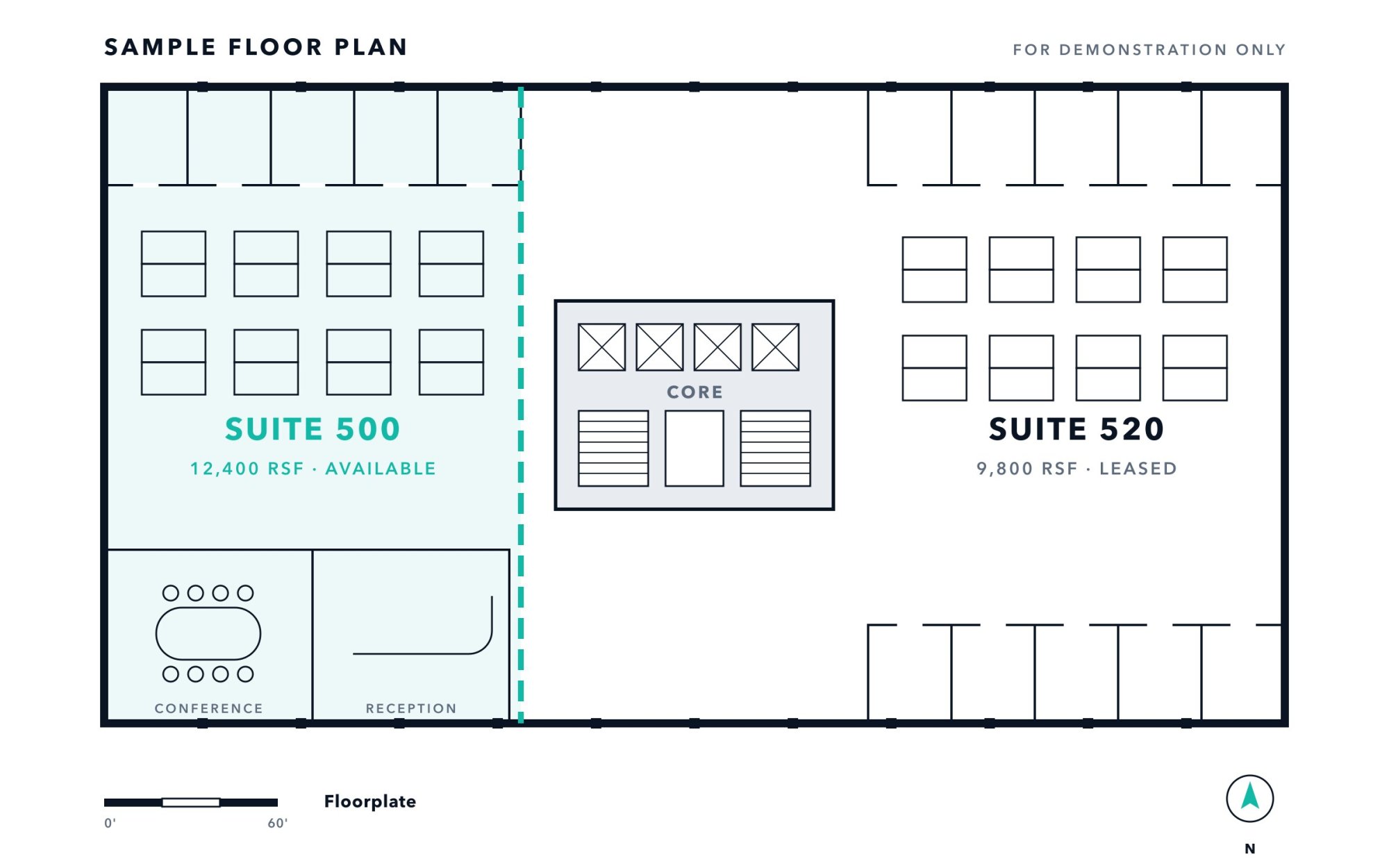
Full width, centered: a floor plan.

60% width, aligned left.

40% width, aligned right.

Dual Column Text

Two rich text columns side by side, stacking on phones. This one has Center Items Vertically turned on, so the short heading sits level with this longer paragraph.

Reverse Mobile Stack

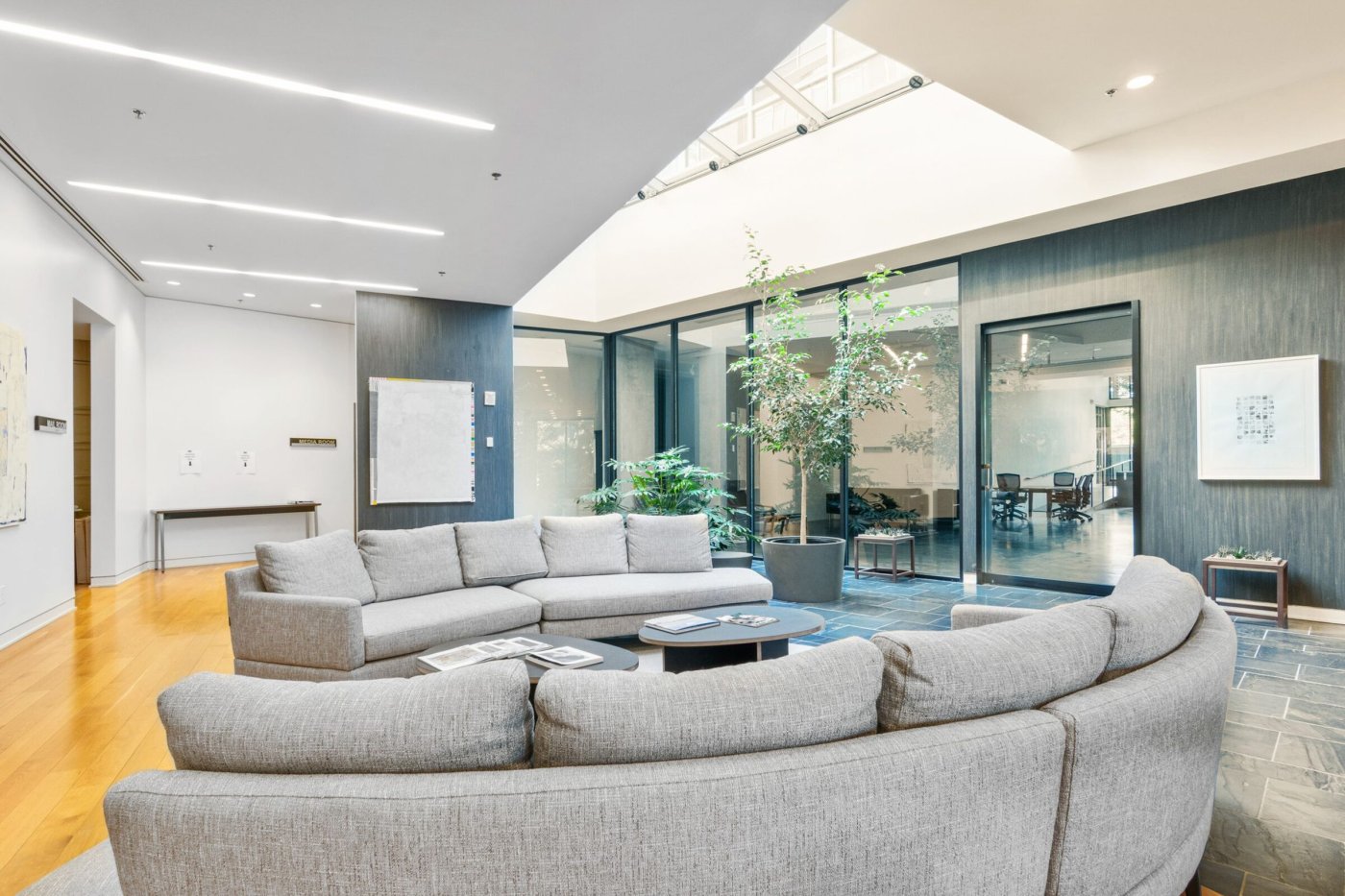
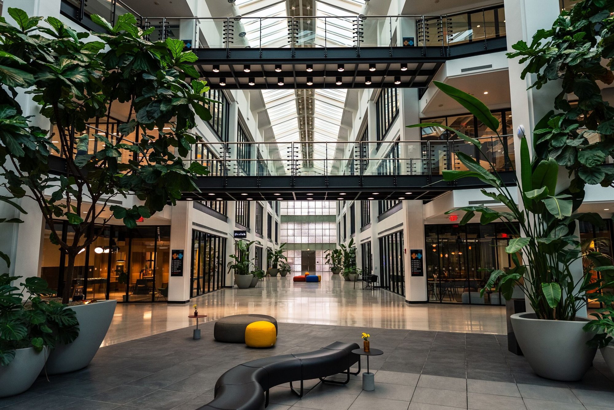
Here the image is in the first column, but Reverse Mobile Stack is on, so on a phone this text comes first. Center Items Vertically is off, so both columns align to the top.

It also shows a dark background override with light text.

A few numbers about this kit

15

content blocks, all on this page

6

theme colors, set once in Site Theme

1,800+

Google Fonts in the font pickers

Stats can show an icon instead of a number

Stat icon

Example: transit nearby

Stat icon

Example: bike storage

Stat icon

Example: sustainability

Stat icon

Example: on-site parking

Images & Video

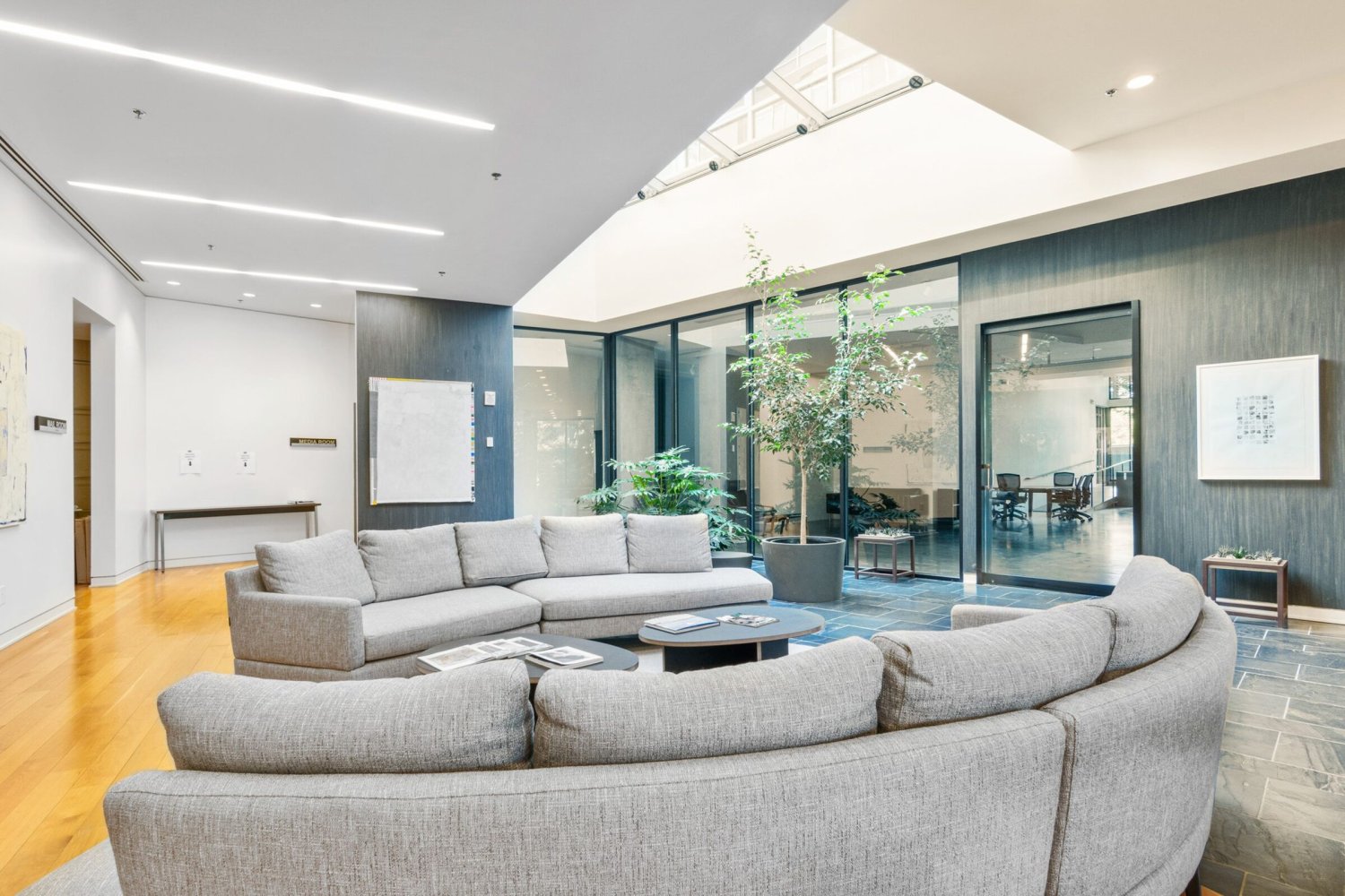
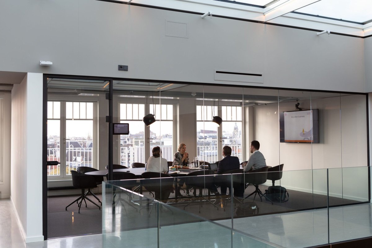
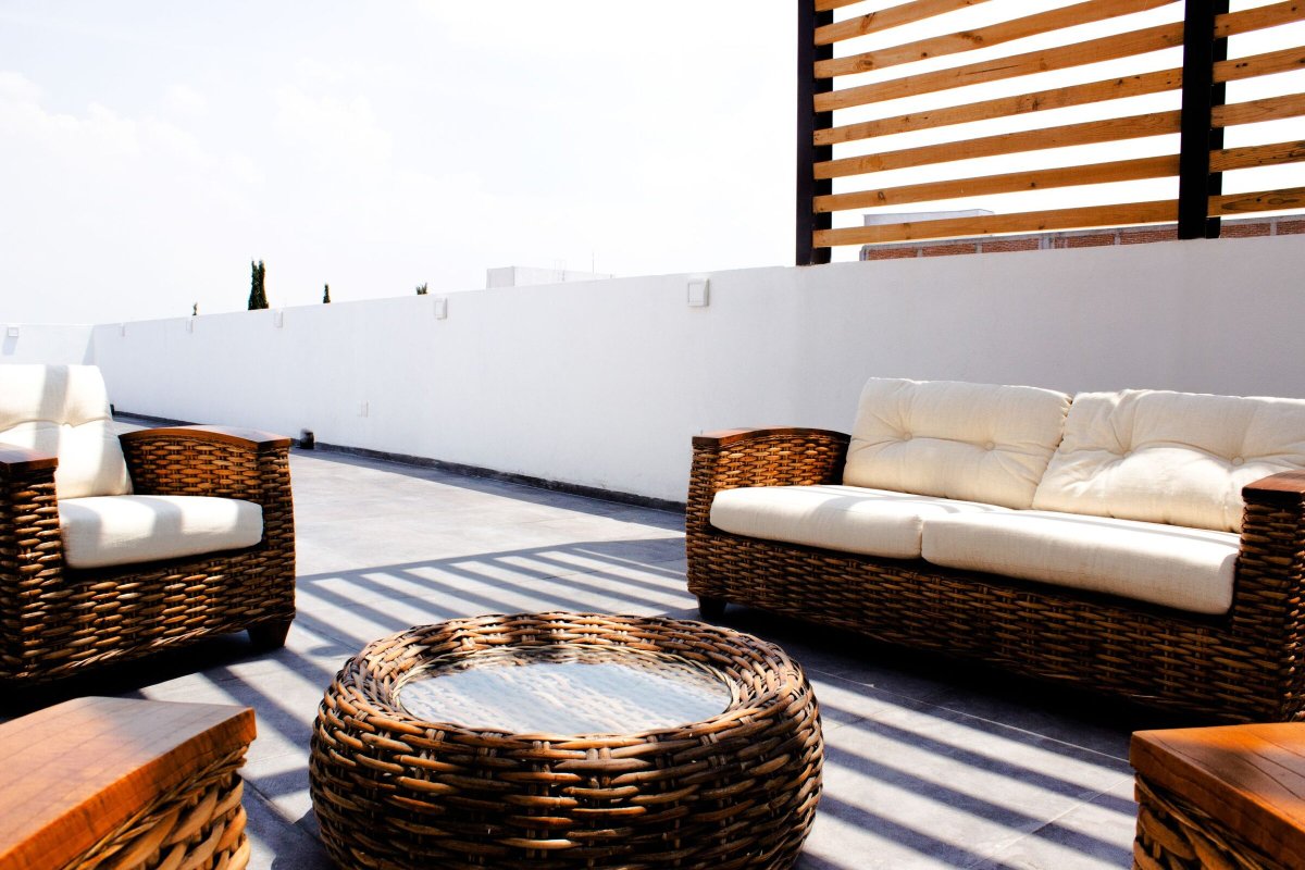
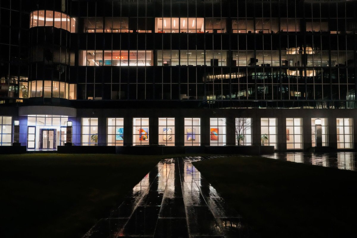
Full Screen Media takes an image or a video. The first one below has a separate Mobile Override image, so phones and tablets get a portrait crop (narrow your browser to see it swap). The second is a video with Playback Controls turned on.

Amenity Carousel

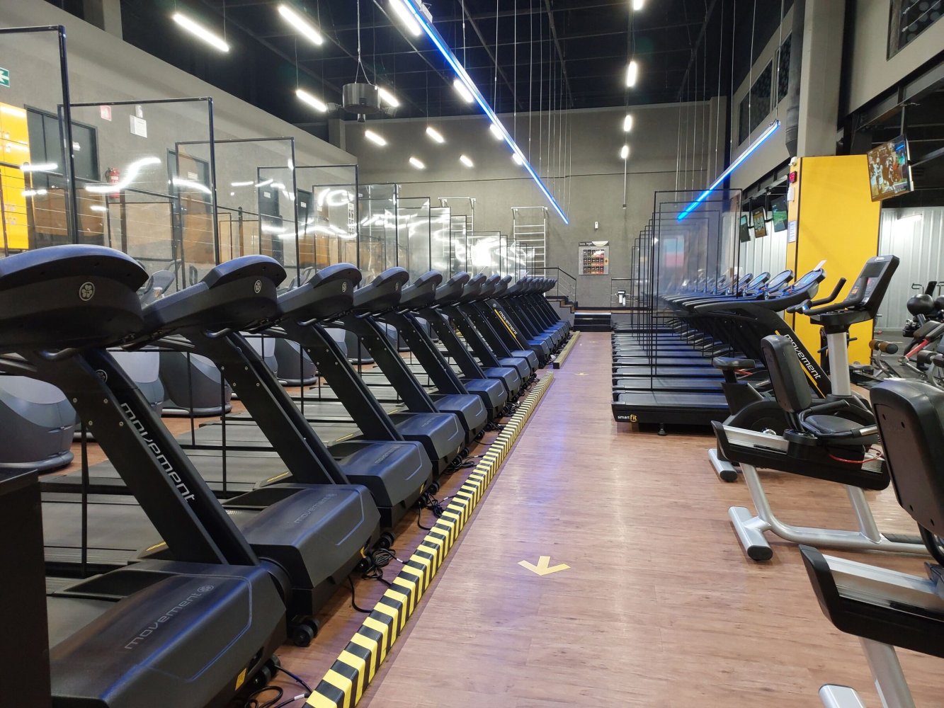
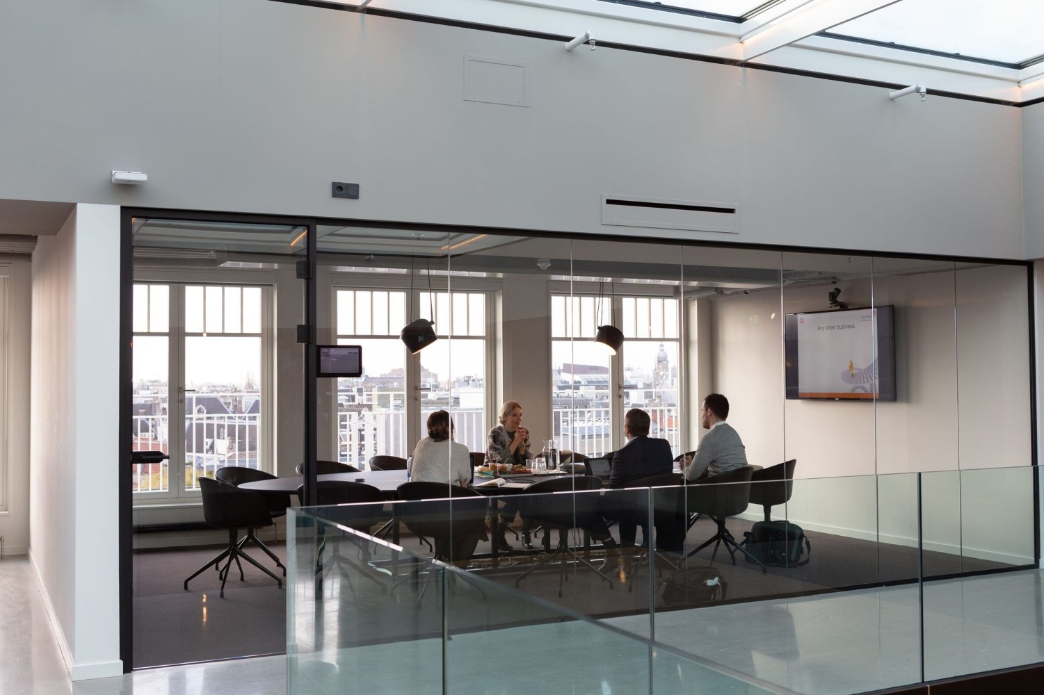
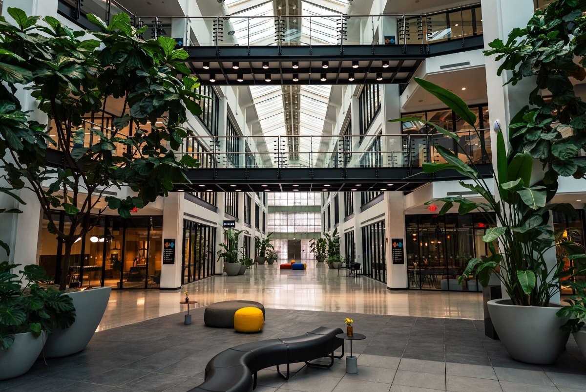
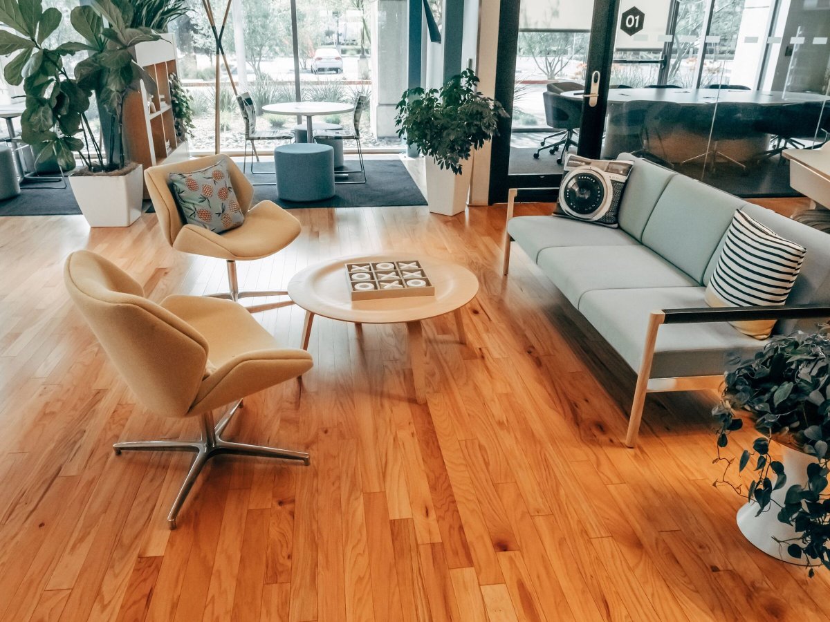
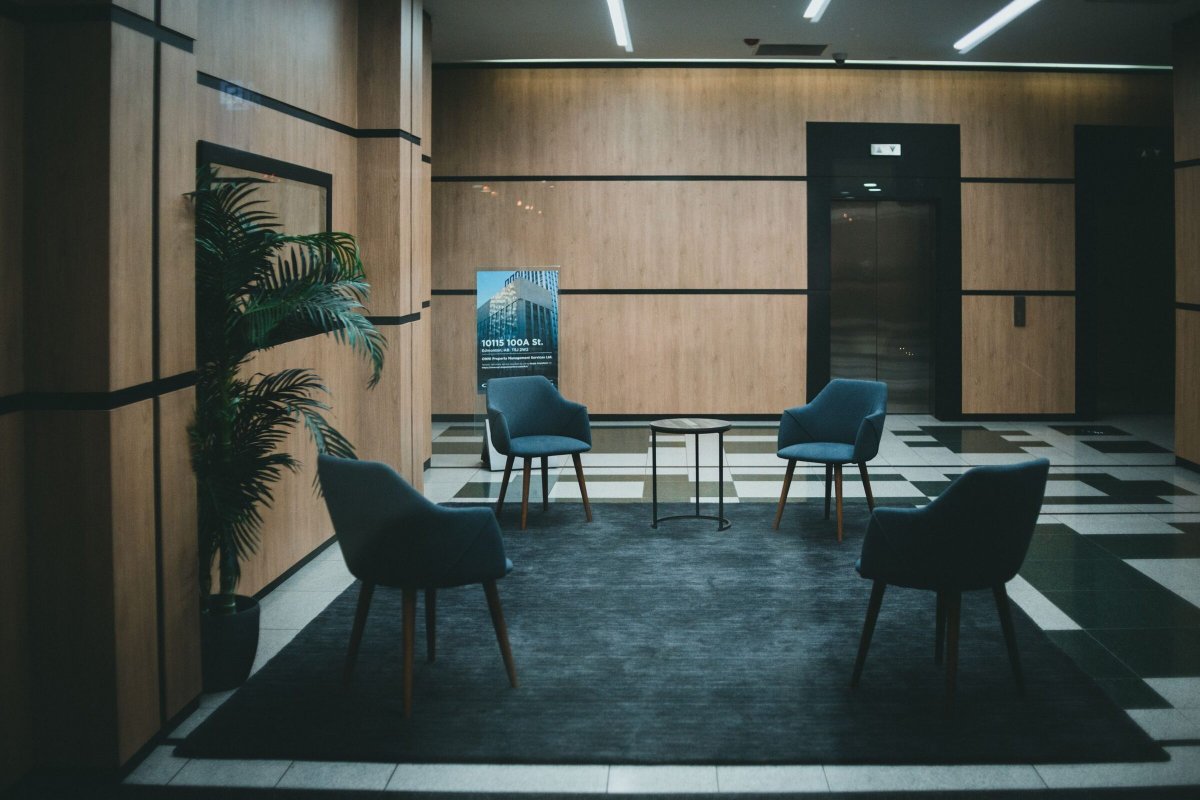
A slideshow paired with copy. This one has the images on the right and teal pagination.

Images on the left

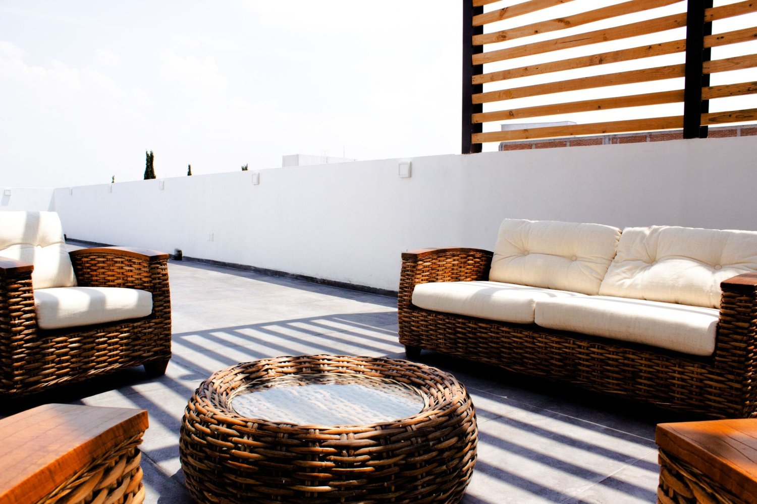
The same block with Image Side set to left, a dark background and white pagination.

Galleries

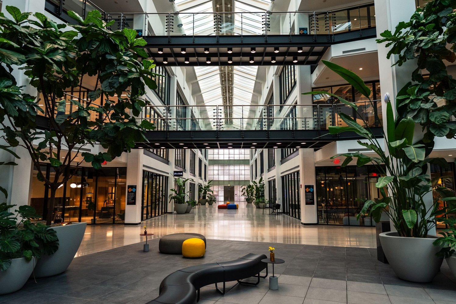
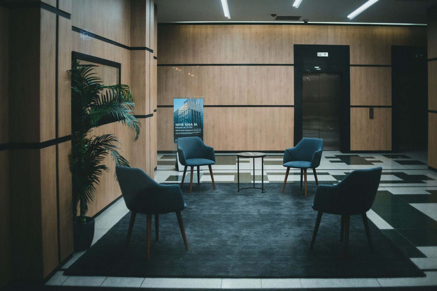
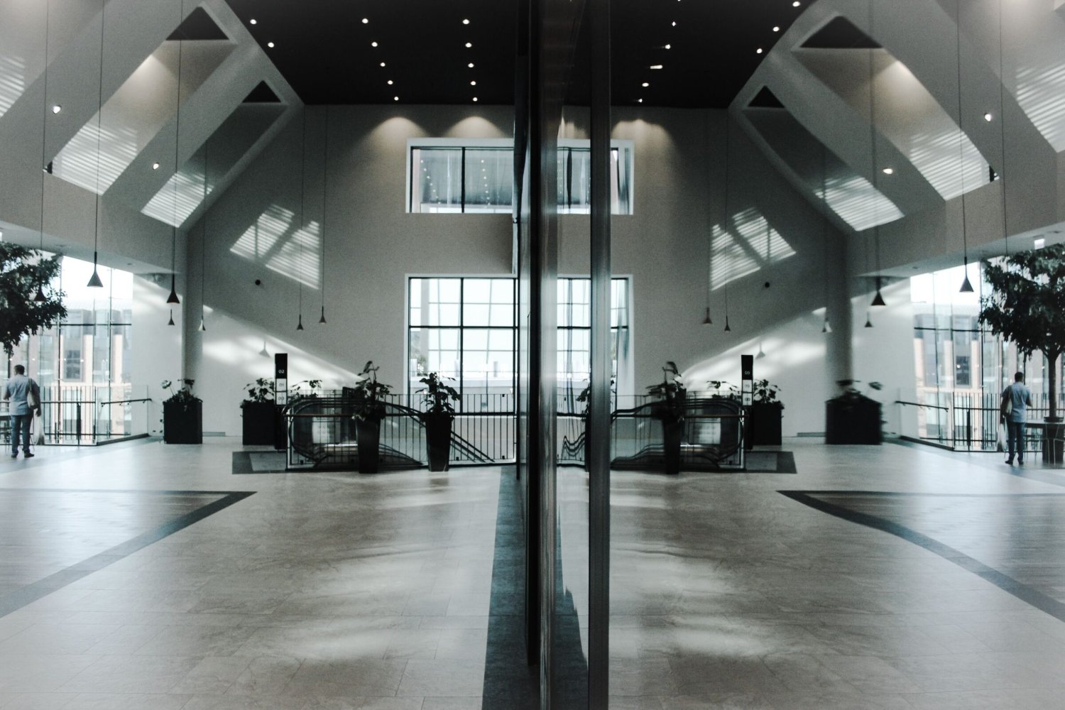
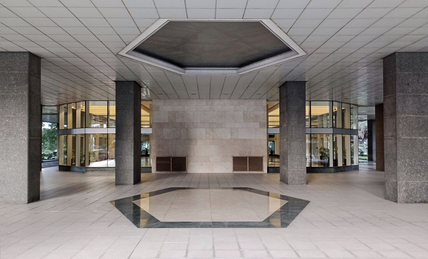
Dual Image Columns shows two images side by side. Masonry Images arranges 13 images in a fixed pattern: 4 small, 6 tall, 2 wide and 1 large.

1
2
3
4
5
6
7
8
9
10
11
12
13

01
Colors

Six colors drive the whole site: primary and primary light (backgrounds), dark and light text, plus accent and secondary. Set them under Globals → Site Theme. They start out as Floorplate’s own palette.

02
Typography

Pick a header font and a paragraph font, then fine-tune weight, size and line height. H1–H6, navigation and buttons can each override the defaults. Also in Site Theme.

03
Logos and favicon

Upload a logo for dark and light navigation bars and a favicon in Site Theme; until you do, the Floorplate mark stands in. The footer logo, address and partner logos are under Globals → Footer.

04
Navigation

Four menus: Main Center Nav, Main Right Nav (links can be shown as pill buttons), Footer Links and Footer Legal Links. Each page also chooses a dark or light nav style.

05
Pages and SEO

Pages live under Collections → Pages. Every page has an SEO tab for its title, description and social image, and site-wide defaults are under SEO → Site Defaults. The homepage is the Home entry; add a content block to it and this site’s welcome screen is replaced by your page.

06
Forms

Contact and event forms come ready to use. Edit their fields and notification emails under Forms, then place one on any page with the Form block.

The same block without numbers

Turn Numbered Rows off for FAQ-style rows. This one also has a white background and a small top spacing override.

What do the spacing overrides do?

Every block has default padding above and below. The overrides swap it for none, small, medium, large or extra large, so you can tighten or open up the rhythm of a page without touching code.

How do anchor links work?

Give a block an Anchor ID and it becomes a jump target. The Anchor Nav near the top of this page lists every block that has one, and navigation links can point straight to them.

5th Floor
12,400 RSF
Available now

Example listing. Each availability opens to a rich text description, so it can hold a floor plan, photos and buttons like these.

6th Floor
24,800 RSF
Available Q3

Example listing with two detail columns. Titles and columns are plain text; the description below is rich text.

7th Floor
Full floor

Example listing with a single detail column, which stretches wider.

8th Floor
Leased

The Availabilities block lists every entry in the Availabilities collection: one per floor or suite, each with short detail columns and an expandable description. Open the 5th Floor to see a floor plan with download and email buttons.

Maps

The first map uses the Warm Topographic style with its border and category sidebar. The second switches to Dark, turns the border off, hides the sidebar and sets a fixed Default Zoom. There are ten styles in all.

Dining

1

Example café

2

Example restaurant

Transit

1

Example station

Form

The Contact form at Medium width. Its fields and notification recipients are edited under Forms → Contact, and submissions show up there too.

Event Form

The Event form at Wide width, with custom submit button text and success message. Forms can also be Narrow or Full Width.

Contact Sections

Leasing Contact

Group contacts under a heading: leasing, management, press.

Property Manager

Each contact is its own rich text area, so it can hold buttons like the email link below.

©2026